Company
ExB
Role
UX Design Intern
Timeline
July - August 2019
Tools
Sketch
Many of ExB's applications were designed at different times by different designers. Therefore, many components do not suit each other. To make the design more consistent and to improve the workflow of designers and developers, the company used material design to develop a new style guide and a component-based design system.
ExB
UX Design Intern
July - August 2019
Sketch
The component library was still missing some components. The input fields and buttons were cumbersome to create because their size always had to be adjusted manually to the length of the label. Furthermore, the components in the component library were not structured.
My Task was to...
To get an overview of the design system, I read Google's own documentation about material design and made sketches of the specs of some components. I also researched on Medium for possibilities to create adaptive input fields and buttons. I made a few sketches of what a hierarchy that structures the components might look like.
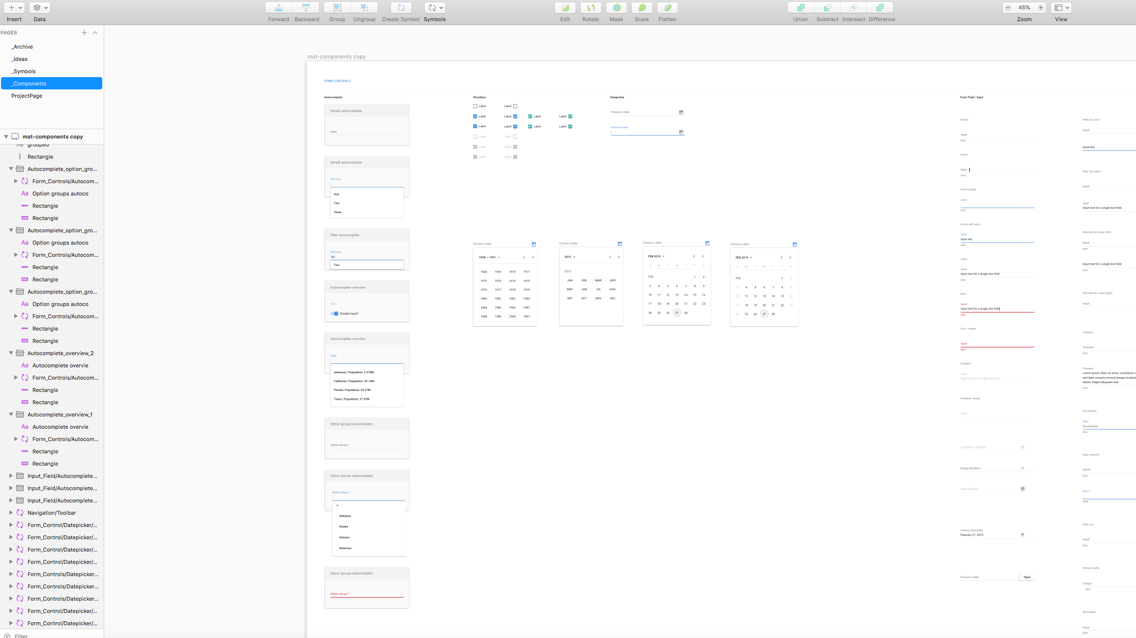
Since the component library was still missing some components, I first built all missing components in Sketch.
I used Google's documentation on material design as a guide to comply with standards.
Also, I made sure to already organize the components while building them to make it easier to structure them later on.
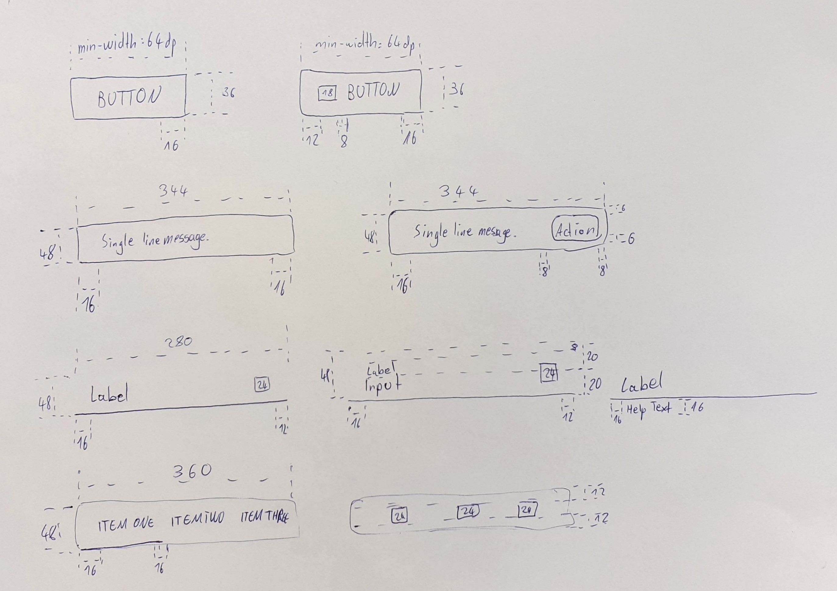
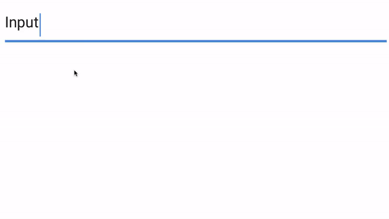
Previously, the designers had to manually position the pipe to match the input and adjust the size of the input field for long inputs when using the input field components. This should be automated to improve the workflow of the designers.
Through adjustments like the alignments I have designed the input field components to be adaptive. The pipe and the size of the input field automatically adjust to the input. This speeds up the design process and makes using the component library more convenient.
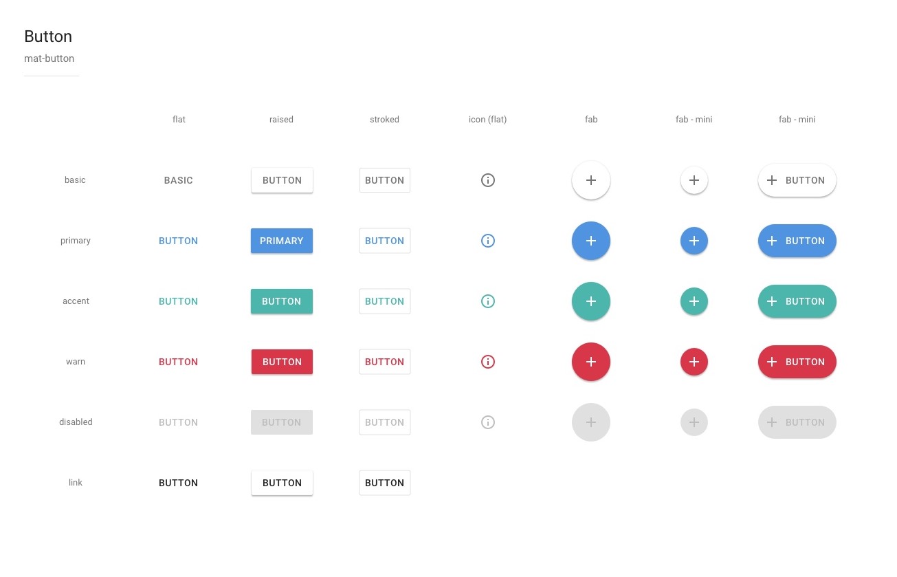
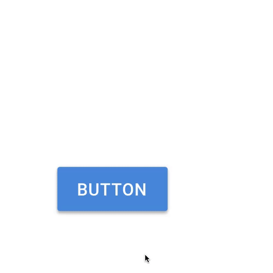
With the Button component there was almost the same problem as with the Input Field component. Previously, the size of the buttons always had to be adjusted manually to the length of the label. It had to be made sure that the buttons had the right padding.
Again, I have solved the problem by making the button component adaptive but this time I used a plugin to solve the problem. The label can now be changed in a dialog that opens with a shortcut. The size of the button automatically adapts to the label and also takes the defined padding into account.
Since the Button component is used all the time, this saves the designers a lot of time.
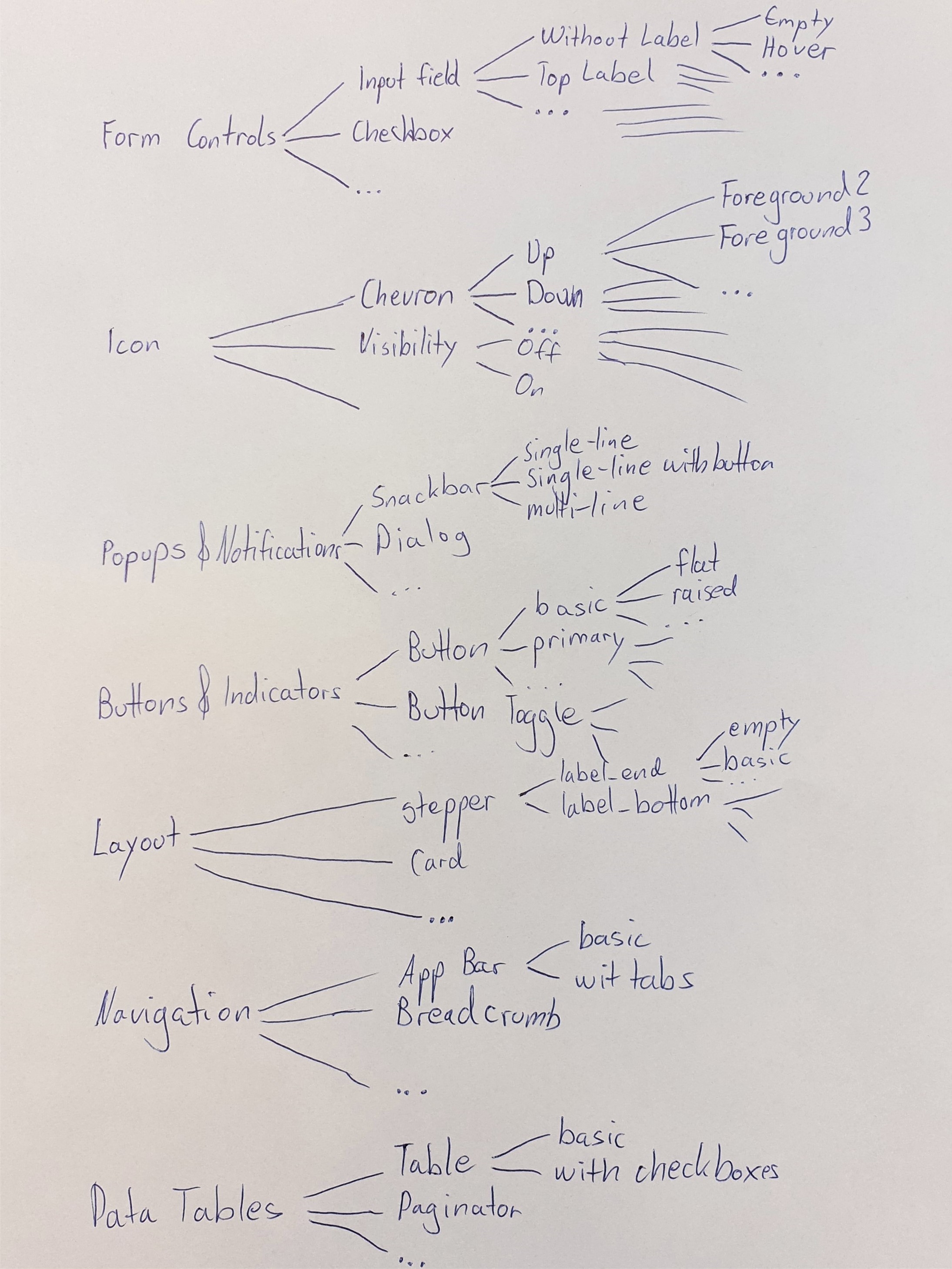
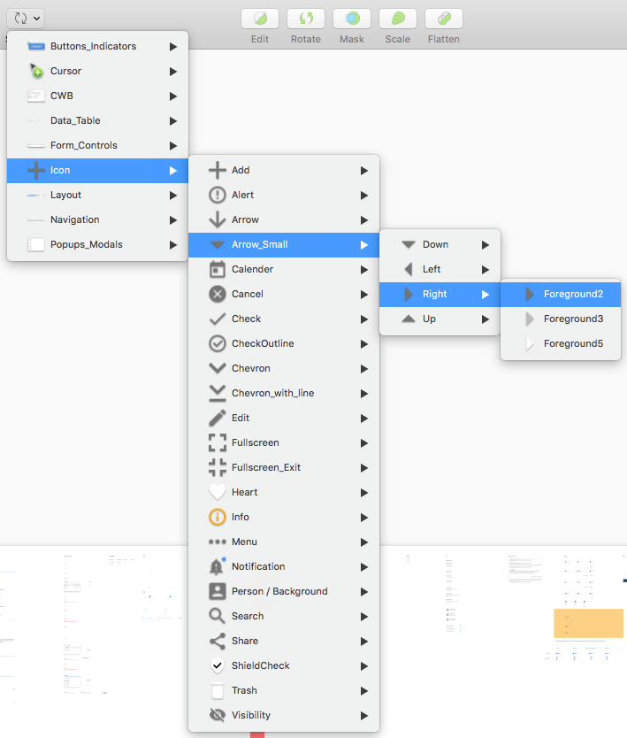
To structure the components, the goal was to develop a hierarchy that contains all components. I compared my ideas for possible hierarchies and decided on a final concept. From the type of component, the hierarchy goes deeper and deeper down to the smallest detail of a component.
In Sketch, I arranged all components as symbols so that they correspond to the hierarchy. Now the components can be found quickly and inserted into the project with just one click.
When using a wide range of components, it is very important to have a unified design system.
I learned how to find my way into a project started by another designer and continue it.
This was the first project where I had the opportunity to design with Sketch and I fell in love with it.