Project Type
University Project
Role
UX Designer
Timeline
October 2019 - January 2020
Tools
Adobe XD, Adobe Premiere Pro
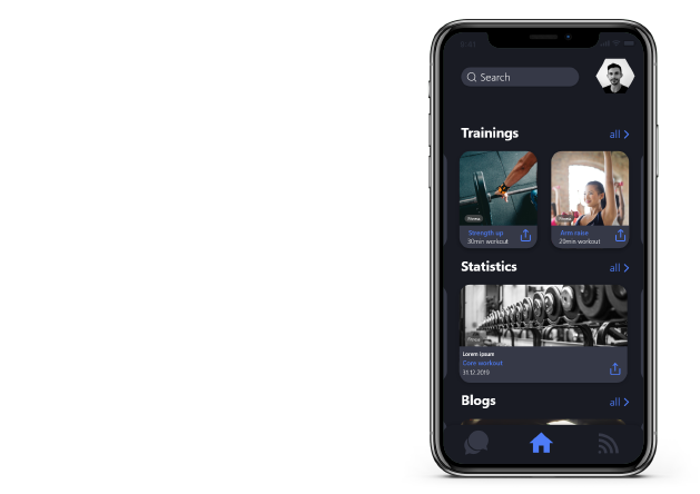
“Mod boxing” - this was the topic of our semester project for the course “Design of human-machine interfaces”. Mod boxing is a modified form of boxing that focuses on the fitness aspect of boxing and prohibits punches on the head and neck area. The project was a cooperation between our university and the QUT in Brisbane with the goal of developing a product and a corresponding human-machine interface.
University Project
UX Designer
October 2019 - January 2020
Adobe XD, Adobe Premiere Pro


Our Australian partners created modular smart tiles to be hung on a wall and punched against to track your mod boxing performance.
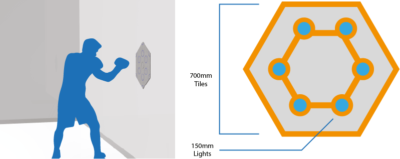
Copyright: Mark van Wijk, Matthew Smith and Matthew Swalwell from QUT
I worked on this project together with a fellow student. My team partner and I thought of the way to interact with the tiles. It was our task to develop an interface for the interaction.
In a brainstorming session we collected ideas on how users can interact with the tiles and decided on an app. Next, we thought about the goals we wanted to achieve and chose the following aspects to characterize our product:
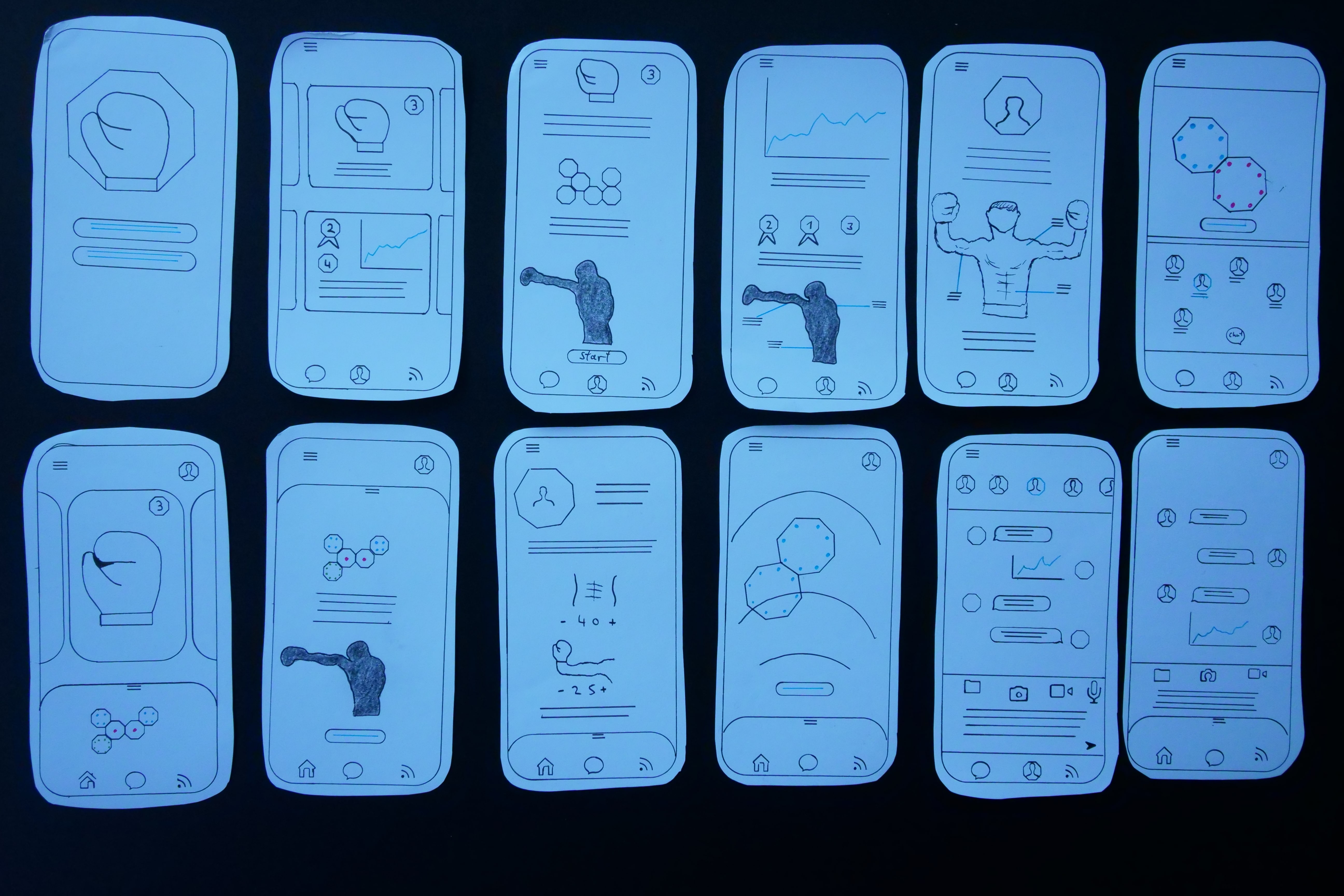
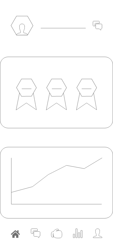
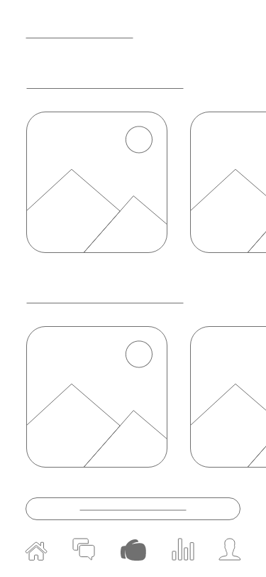
We visualized our ideas by creating many sketches of the interface and ran quick usability tests using paper prototypes. Based on the insights we gained from these tests we applied changes to our prototypes. We improved our idea step by step until we had a set of prototypes which we felt were ready to be made into wireframes. The wireframes helped us to fully focus on the functionality of the app.
To define our target group, we created different personas. All of our personas share an interest in mod boxing, but have different amounts of time and different demands for a mod boxing app.
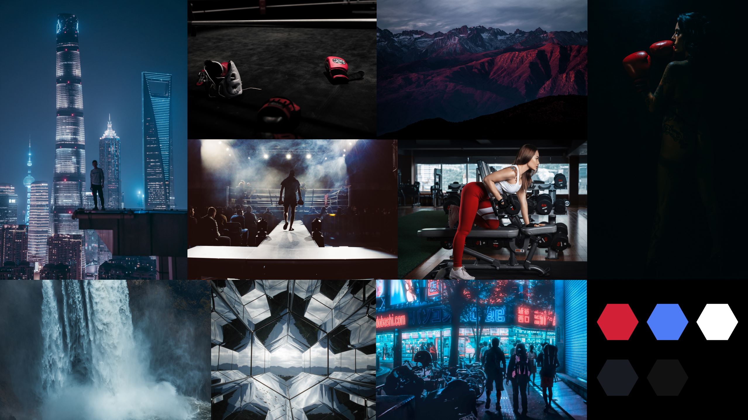
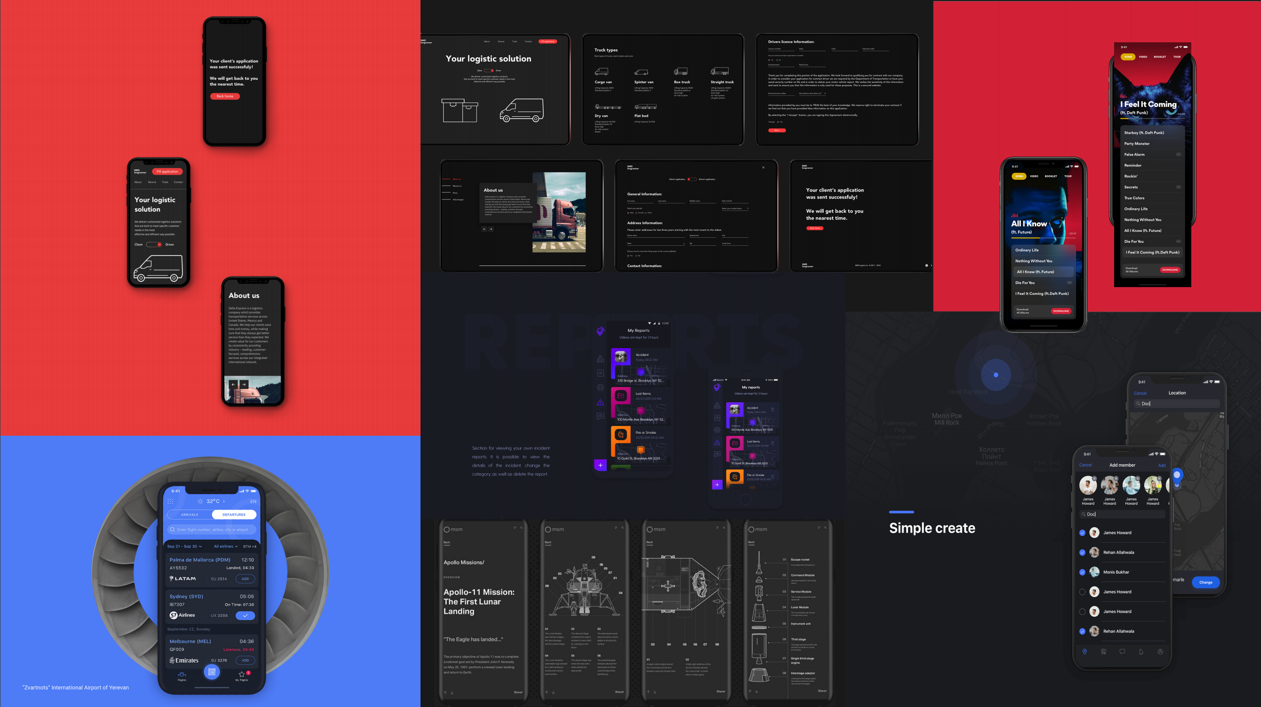
By creating mood boards, we defined what the overall feel of our app should be like and which colors we wanted to use for our design. We chose different shades of dark grey to be the main colors for our interface. A powerful blue and red accompanied by some white are the highlight colors. They symbolize strength, endurance, dynamics, energy and power which is exactly what we want our users to feel when using our product.
Since we want to enable everyone to train at various locations at any time, it is necessary that everything can be set up quickly and easily so that users do not lose any time.
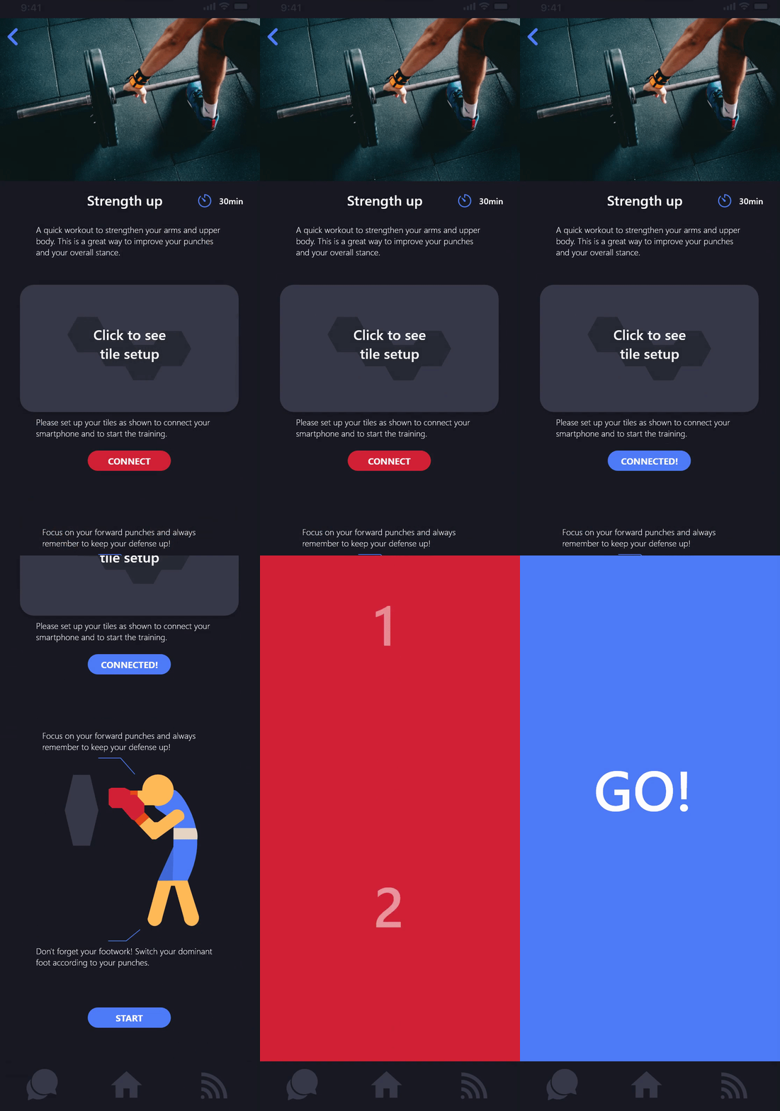
First the user chooses from a wide range of trainings. The app shows exactly how the tiles for the selected training have to be arranged and how the exercises are performed properly. With just one click the app can be connected to the tiles via Bluetooth and checks if the tiles are arranged in the right way. Now the user only has to start the training and that's it.
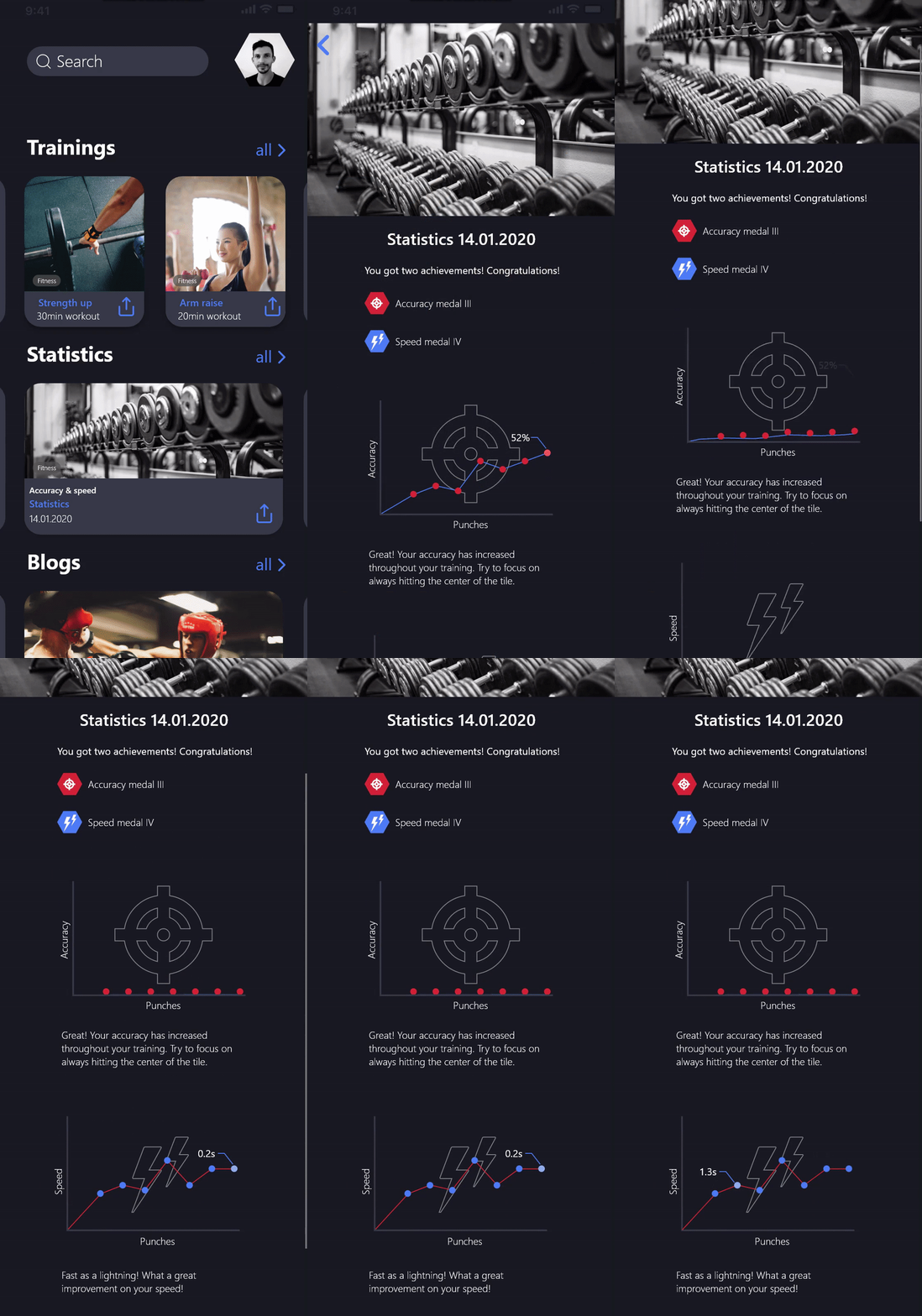
It is extremely important for athletes to see their progress so that they can train effectively. That's why the app creates statistics after every training session, showing the progress.
The statistics are displayed as interactive graphs to provide a complete overview while also allowing the users to view and compare their exact scores.

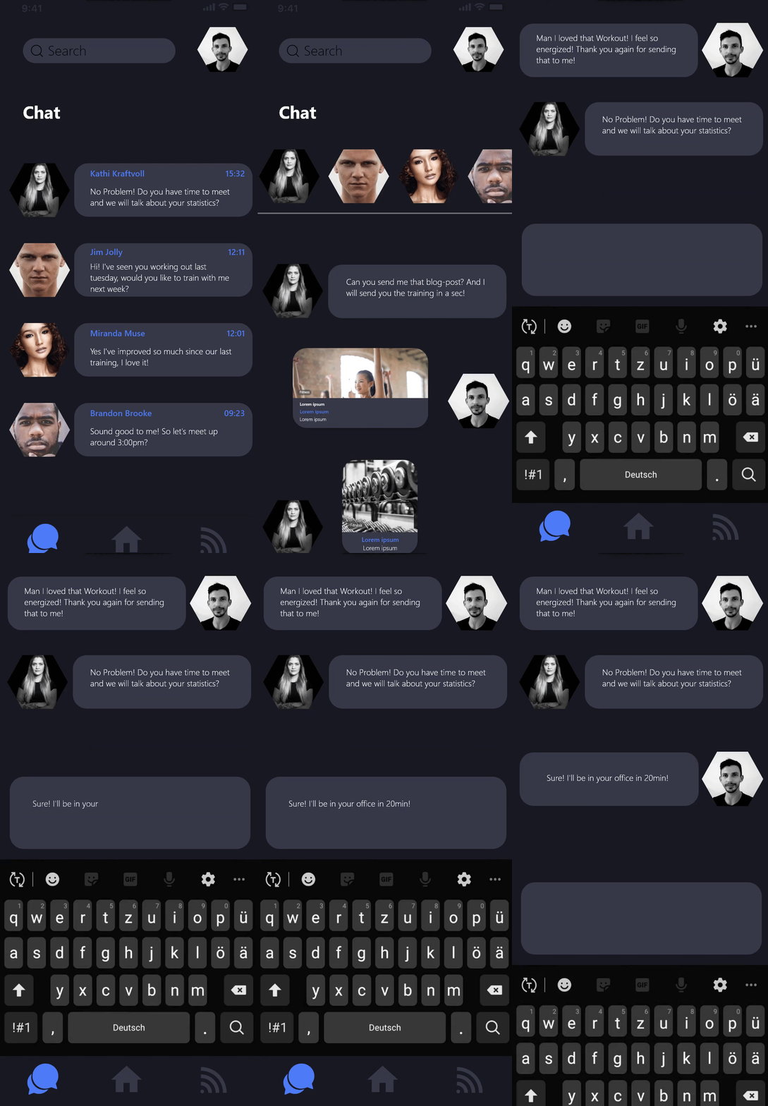
In a social environment where athletes train together, they are usually more motivated for the training. Therefore, we have integrated a chat feature into our app. Athletes can interact with each other as well as share their statistics. This should encourage the athletes to motivate each other and create a feeling of community.

The users of our product should not only be able to communicate with other athletes, but also with coaches. Therefore, we also want to address coaches as stakeholders.
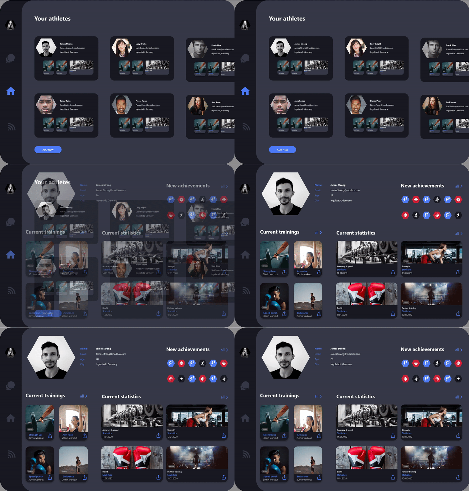
Since coaches often supervise several athletes, we decided to design a tablet version of our app especially for coaches. It provides an overview of all athletes a coach is supervising and their statistics. Furthermore, it also includes the chat function so that coaches can give valuable advice to the athletes.
To visualize the complete product, especially the interaction between the app and the modular smart tiles, we made a short video. Since our cooperation was with an Australian university, we were not able to show the real tiles in our video. Therefore, we made simple prototypes of the tiles to demonstrate the interaction.
The video is about a business man who, thanks to Hexa Tiles, is able to integrate mod boxing into his stressful workday.